
drought in the world
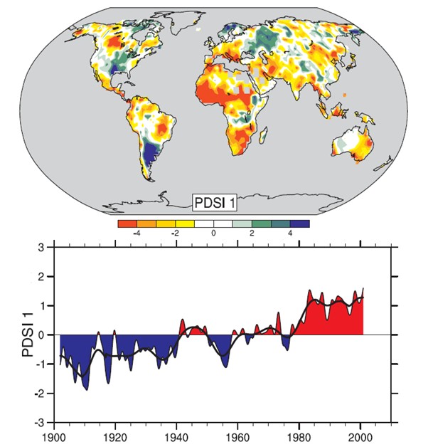
Figure 1: The most important spatial pattern (the first element of the principal components analysis; top) Severity Index of the Palmer drought (PDSI) monthly from 1900 to 2002. The PDSI is a major indicator of drought measures the cumulative deficit (relative to local average) moisture to the land surface, by integrating previous precipitation and estimates of increased moisture in the atmosphere (based on atmospheric temperatures) in an accounting system hydrologique.13 The bottom graph shows the evolution of the sign and intensity of this configuration since 1900. When the values of this graph are positive (or negative), areas in red and orange upper map are drier (or wetter) and areas in blue and green are wetter (or drier) than average. the Black smooth curve shows decadal variations. The time series correspond approximately to a trend, and this configuration and its variations account for 67% of the linear trend of PDSI from 1900 to 2002, the land area the globe. They also show a general increase of drought in Africa, especially in the Sahel, for example. we is also more humid areas, especially in eastern North America and South and in northern Eurasia (from Dai et al., 2004b). [WGI QF 3.2]