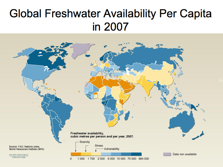
Global Freshwater Availability Per Capita (2007)

This map shows the amount of freshwater available per person in the year 2007. Orange and yellow regions depict water scarcity, while blue regions denote relative water abundance.
Image Type
Category
Level
Source
