Will Climate Change Lead to Conflict or Cooperation?
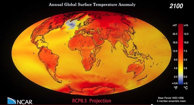
UNITED NATIONS, Aug 4 2014 (IPS) - The headline of every article about the relationship between climate change and conflict should be “It’s complicated,” according to Clionadh Raleigh.
Center for Sustainable Energy
This is the .PDF version of Len Hering's PowerPoint Slides
Matt McGrath
A long-awaited UN report on how to curb climate change says the world must rapidly move away from carbon-intensive fuels.
There must be a "massive shift" to renewable energy, says the study released in Berlin.
Global Surface Temperature Anomally from 1850 - 2100
Six ensemble average of the CCSM4 monthly surface temperature anomaly (relative to 1850-1899 average for each month) from Jan 1850 to Dec 2100, from CMIP5 historical + RCP8.5 scenario runs.
“This figure shows carbon dioxide emissions from 1990 to 2011 for different regions of the world. These totals do not include emissions or sinks related to land-use change or forestry. Inclusion of land-use change and forestry would increase the apparent emissions from some regions while decreasing the emissions from others.” – United States Environmental Protection Agency
"This figure shows worldwide greenhouse gas emissions by sector from 1990 to 2010. For consistency, emissions are expressed in million metric tons of carbon dioxide equivalents. These totals include emissions and sinks due to land-use change and forestry.
“This figure shows worldwide emissions of carbon dioxide, methane, nitrous oxide, and several fluorinated gases from 1990 to 2010. For consistency, emissions are expressed in million metric tons of carbon dioxide equivalents. These totals include emissions and sinks due to land-use change and forestry.” – United States Environmental Protection Agency
“This figure shows concentrations of carbon dioxide in the atmosphere from hundreds of thousands of years ago through 2013, measured in parts per million (ppm). The data come from a variety of historical ice core studies and recent air monitoring sites around the world. Each line represents a different data source.” - United States Environmental Protection Agency
“This figure shows how annual average temperatures worldwide have changed since 1901. Surface data come from a combined set of land-based weather stations and sea surface temperature measurements. Satellite measurements cover the lower troposphere, which is the lowest level of the Earth’s atmosphere. “UAH” and “RSS” represent two different methods of analyzing the original satellite measurements. This graph uses the 1901–2000 average as a baseline for depicting change.
“This figure shows how annual average temperatures in the contiguous 48 states have changed since 1901. Surface data come from land-based weather stations. Satellite measurements cover the lower troposphere, which is the lowest level of the Earth’s atmosphere. “UAH” and “RSS” represent two different methods of analyzing the original satellite measurements. This graph uses the 1901–2000 average as a baseline for depicting change. Choosing a different baseline period would not change the shape of the data over time.” – United States Environmental Protection Agency