Global Electricity Use and Connectivity (2010)
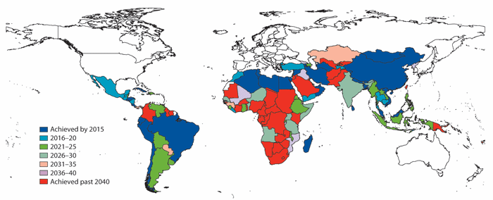
This map shows the global electricity distribution, with obvious scarcity in Sub-Saharan Africa and parts of South America.
This map shows the amount of freshwater available per person in the year 2007. Orange and yellow regions depict water scarcity, while blue regions denote relative water abundance.
CIA World Factbook 2008
Shows the percent of the population living in poverty (less than 1.25 USD per day) by country.
wikipédia
temperature anomalie
Map showing the estimated dates for achieving the Millienium Development Goals.
Mapping of the 8th continent
mapping of the oil spill in europe
mapping of the worst oil spill of history
Maritime transport accounts for at least 80% of global trade and includes significant quantities of potentially destabilizing commodities such as weapons, narcotics ammunition and other hazardous materials.
Changing population densities throughout the continents.