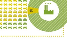
Visualizing Oil Addiction In The U.S.

09-28-2012

ARIEL SCHWARTZ

Sep

A tiny percentage of the United States uses more than 10% of all our oil. If we want to cut back, these people might be a good place to start.

How to Make Global Fisheries Worth Five Times More


ScienceDaily (July 13, 2012) — Rebuilding global fisheries would make them five times more valuable while improving ecology, according to a new University of British Columbia study, published July 13 in the online journal PLoS ONE.

Process of an Online Transaction

Submitted by marcela1991 on Thu, 08/16/2012 - 11:29

This image displays the process of an online transaction. The image shows the flow of how a customer can purchase a product online. After, the transaction is completed when the money is withdrawed from the customer's bank into the merchant's bank. The flow chart displays the facile manner in which an electonic purchase can be made. 

Level
Image Type

Global Undernourishment (2006)

Submitted by shirab12 on Tue, 07/24/2012 - 10:44

This map shows the percentage of the population that is undernourished (the World Health Organization's standard of measuring hunger) by country. Sub-Saharan Africa, all of Asia, and Latin America are hunger hotspots, with a minimum of 5% of the population undernourished.

Level
Image Type

World Food Price Increases Over Time

Submitted by shirab12 on Tue, 07/24/2012 - 10:39
Source

Food and Agriculture Organization of the United Nations, International Food Policy Research Institute

This is a combination of two images. The top chart shows the increase in the prices of rice, wheat, and maize from 2005 to 2011. These three crops are the major food staples in most developing countries. The graph underneath depicts the World Food Price Index, which measures the increase in world food prices over time. Since 2007, world food prices have increased dramatically, contributing to the cycle of poverty in the developing world.

Level
Image Type
Subscribe to Consumption